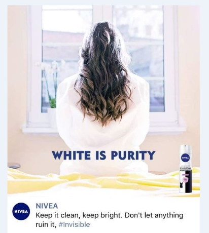
Niviea is a personal care brand that specializes in personal hygiene and skin care. It was in 2017 that Niviea came up with its ‘white is purity’ print ad for its deodorant. The ad featured a woman who was dressed in white and facing her back, while the setting of the ad was whitewashed with the use of pastel colour walls and other lighting elements, along with the tagline of “white is purity”. The post was furthermore captioned “Keep it clean, keep it bright. Don’t let anything ruin it”.
The elements of the post led it to be misunderstood by the majority of the audience, things took a critical turn when the statements of the post were used by the people of the alt-right community to defend their white superiority beliefs.
Nivea was accused of being ‘racist’ and promoting extremist ideas, the controversy captured the attention of the international media with the involvement of mainstream newspapers like BBC, CBS, New York Times, and Business Insider.
The brand approached the controversial scenario in a very professional manner by apologizing for the miscommunication and conveying to the public its ideals, this absorbed the impact of controversy and prevented long-term impact.
In this article we will do the Nivea white is purity ad analysis and look into the elements that caused miscommunication and how it could have been delivered efficiently.
Elements leading to miscommunication:
- Audience knowledge in communication
The target audience of the brand was the Middle East as the ad was published in that region. People from the Middle East have a brown skin tone with olive being the lightest. A white-washed advertisement is not a wise choice as the audience will not resonate with it leaving it open to alternative analysis, which in this case was traced back to the history of colonism. Research and understanding of the target audience are necessary and need to be aligned with the brand message and advertisements.
- Alternative meaning of words
In the English language, some words have more than one meaning these words are known as Homonyms. It is important to look into the dictionary meaning of your choice of words to make sure there are no alternative meanings present that are not in alignment with your brand message. In the Nivea white is purity and the word ‘white’ was understood by the audience as the slang used to describe European/extreme fair skin tone, although the brand message was the colour white.
How the brand message could have been delivered effectively:
- Use of synonyms
The word ‘white’ could have been replaced by a synonym like ‘ivory’. This will limit the context of interpretation as it will be constrained to the colour. Reducing the possibility of subjective interpretation. The choice of synonym should be made only when the brand strictly needs to adhere to the tagline and the present words in the sentence have the potential for subjective interpretation.
- Leveraging the brand colour pallet
Colour psychology is a critical branch of branding, how people perceive your brand depends greatly on its visual representation. Niviea has two main colours in its logo blue and white, blue is considered the colour of safety and protection in Middle East culture, as the context of colour is subject to change depending upon the culture. The advertisement could have used the tagline “blue is protection” with the text in white highlighting its point that white is purity. Since the ad was designed to promote a stain protection deodorant this approach will have suited well with the brand objective. The caption of the picture could be the same ‘Keep it clean, keep it bright’.
A minor change in advertisements changes how it is perceived, effective communication of brand message is the most important aspect of advertising.
